Modeling whether an outbreak of COVID-19 virus will hit San Francisco
Epistemic status: To be clear, this is a highly simplified model and should not be used to insight panic or to instill a false sense of security. Please enjoy with a healthy level of skeptical detachment.
Edit: Note that when I originally published this, the WHO had not settled on the name COVID-19 yet so I was referring to it as "Wuhan virus." That has since become problematic so I am updating to reflect more accurate terminology.
I'll admit that I've gotten wrapped up in all this WuhanCOVID-19 virus stuff, especially as it relates to the spread in the SF Bay Area. This is the first time that I've lived in a large population center while there is a potential epidemic looming, and the situation has me wondering whether we're already to the point where it's bound to spread here anyway. I looked at some results from one of the sophisticated epidemiological models, and I got some reassurance. But I was curious how these models worked under the hood.
To get a better intuition, I developed a simplified version of that epidemic model, and an interactive visualization of my simple simulation. The model allows you to vary the infection spread rate, the rate of quarantine, and the rate at which people fly from Wuhan to San Francisco. Try it out, and read below to learn more about how it works.

Defining a model of Wuhancoronavirus virus spread
I've left out a lot of detail in this section for simplicity. To see the full derivation check out this document.
I wanted to simplify the standard SIR model, and apply it to two locations. An SIR model normally computes how the spread of an epidemic varies as the population moves from Susceptible (S) to Infected (I) to Recovered (R).
Diagram of transitions in SIR model (source Imoen)
There is a specific dynamics model that governs how S, I and R vary over time. However, I'm only interested in the early phase of the epidemic, when it's only spread to a small fraction of the population. In that case, we don't need to worry about how many people are susceptible or recovered, we just always assume that there are lots of uninfected people around who can become infected.
I worked through defining a mathematical model that looks just at the early infection phase of an epidemic. You can look here for details on how the math works, but I'll just give a short summary here.
Exponential Infection Model
The model works by defining the "net infected rate," which is the number of newly infected people minus the number of people who are moved into quarantine. We're going to make the assumption that the change in the number of infected people, I, is equal to the current number of infected people times a constant growth rate, \gamma. We can formalize this in an equation.
\frac{dI}{dt} = \gamma I
This equation can be solved to give the standard exponential growth curve of an early phase epidemic. However, if this equation were the whole story, this would mean that all infectious diseases should turn into exponentially growing epidemics, and we know that isn't the case. Specifically, we have public health policies that can work to quarantine and mitigate the spread of a disaster. For this model, we're going to assume that our ability to quarantine people is set at some fixed constant, \kappa, so if the growth rate surpasses that, we'll end up with an outbreak. To model this, I'm going to combine these two terms into one equation like this.
\frac{dI}{dt} = \gamma I - \kappa
This equation is also fairly easy to solve, and the solution grows exponentially whenever the infected population crosses the threshold of \kappa / \gamma.
So this equation will work to model the epidemic in one place, but we want to see how the situation evolves if it can spread to another place, like the case for spreading from Wuhan to San Francisco. The two equations to model Wuhan and SF look like this:
\frac{dI_{wu}}{dt} = \gamma I_{wu} - \kappa
\frac{dI_{sf}}{dt} = \gamma I_{sf} - \kappa + \mu I_{wu}
You can see that the first part of both equations is the same as the simple infection equation for I above. However, in the I_{sf} (ie San Francisco) equation, there's an extra term of \mu I_{wu}. This is the rate of people who are sick in Wuhan flying to San Francisco.
Simulations
I took this model definition and generated simulations that show how the values of I_{wu} and I_{sf} vary over time. These kinds of simulations just take the equations above and use them to determine how the number of people infected would change over a small unit of time. Then, they do this over and over again to show how the system evolves. I used prepackaged simulation software to diagram the solution to the equation I had above, and it gave curves that showed the growth in the number of infected in the two locations over time.

Next, I used the simulation to see what happened if I varied how long before flights were shut down. I called this time t_Q. In this simulation, I set t_Q to be very short and saw that even though the infection started to spread in SF, it went back down to 0 right after flights were stopped.

As you might expect, if the time before Wuhan is quarantined (t_Q) is short, then the infection doesn't have too much time to spread to SF, and they are able to fight the epidemic back down to 0. But if I extend t_Q past 5, suddenly the model predicted that it wouldn't be possible to keep it under control.

This makes intuitive sense, but it was still quite curious to me what might cause everything to be fine at 4.9 days, but for an outbreak to happen after 5 days. I decided to see if I could use my model to see what set the time of the "point of no return."
Predicting the "point of no return"
I worked through this model a little more rigorously both with the simulations and with an analytical theory. I'm going to gloss over the rest of the analysis I did for this post, but please read the full article, and my analysis notebook if you're curious how I arrived at the results.
I evaluated the time of the "point of no return," t_X as
t_X \approx \frac{1.7}{\gamma} \left(ln\left(\frac{\gamma}{\mu} - 1\right)- ln\left(w_0 - \frac{\kappa}{\gamma}\right)\right)
Where I added in the initially infected population in Wuhan w_o as another parameter. This might look a little mysterious, but you can read the math to get a better sense of where it comes from. To double check my work, I directly measured t_x using my simulations.

This pretty surface matched my prediction closely and showed the correct dependence on the logarithm of the Wuhan to SF flight rate \mu.
Putting the math into practice
So that's a nice formula to have, but unfortunately, it's totally useless without knowing what these parameters, \gamma, \kappa, and \mu are. So how can we figure them out?
Well fortunately, we can guesstimate \gamma just by looking at what's happened in Wuhan. If we fit the data for the early part of the outbreak, which looks roughly exponential. The growth constant of that curve is \gamma.

I plotted the data in this google sheet and got an estimate for \gamma of 0.2-0.3 new cases per infected person per day. The reported number of cases is probably an underestimate of the total population that is infectious, but if it differs by a constant multiplicative factor, then (I think) cases should still give a good approximation of that constant.
It's a little tougher to get \kappa, but since an outbreak did happen starting from ~200 cases, we expect that \kappa can't be more than 200*0.2 ~ 40 people per day.
Finally, for \mu, we can calculate it directly because \mu is just the probability that any person will get on a plane and fly to San Francisco. I just looked up the number of scheduled flights from Wuhan. I estimated about 3 flights per week from Wuhan straight to Northern California, and Wuhan has a population of about 60 million. That makes an estimate for \mu of 3 flights x 200 people per flight / 60 million people / 7 days per week or 1e-6 new infected people in CA per infected person in Wuhan per day.
This means that t_X \approx 60. According to this timeline, the border with Wuhan was closed on Jan 22nd, and the outbreak was only at 200 cases on Jan 19. From this, it would seem like we should have it very much under control.
Of course, this is way too optimistic because we know that Wuhan isn't the only place where the epidemic has spread. The virus has spread over many parts of China by now, and any of those places could serve as a source of the viurs now.
Modeling two locations
Unfortunately, I don't quite have time to properly model the general case for when we cross the "point of no return" from a spread from one of many cities. I assume that my analysis would probably look like the original paper that I was basing this on. However, I did make a simple approximation for a hop between two cities.
Again, you'll have to go through my derivation to see the details, but these simulation results showed that the formula for t_X was roughly twice the value of the single city estimate.

To use this estimate, we'll have to adjust the parameter t_X to account for there being more flights from other parts of China than there were for Wuhan. Unfortunately for us, there are about ~100 times more flights coming from all of China than were coming from Wuhan directly. That means we'd estimate that we had 21 days to stop flights from all of China. Not impossible to pull off, but depending on how you define exactly when the epidemic started, we might have missed that window.
Don't panic. But also, maybe don't fly to China right now.
You should keep in mind that this whole exercise is just a very simplified model that can help you think about how this process works. It does not make accurate quantitative predictions about the probability that there will be an outbreak or whether you, personally, will get sick. It shouldn't make you feel more safe or more terrified, and you should not use it to inform your decision making about infection mitigation. You should use this to get more excited about using math to inform your mental picture of the world.
Now, if you'll excuse me, I'm going to go wash my hands.
Appendix: Let's make it look cool
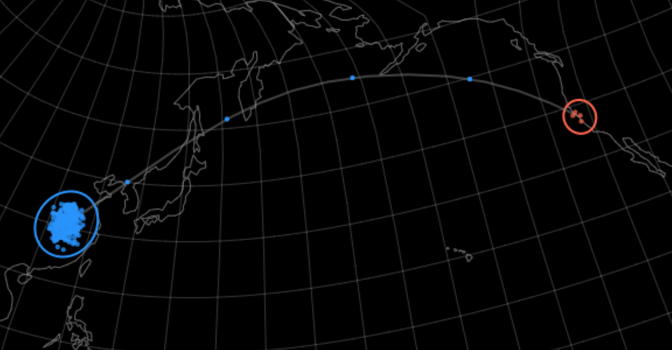
These graphs are nice, but if there's one thing I learned when working on simulations in grad school, it's that you can't just show the results, you have to show a pretty visualization too. So to do that, I built these simulations into a d3 map visualization.

To build it, I figured out the map projection using this tool, and I added the animated graph at the bottom based off this example. The coolest and most fun part, though, was animating the dots that fly from Wuhan to San Francisco, which I based off this code block.
The really tricky part was manually implementing a differential equation solver in javascript. I ended up just using the forward Euler method even though that is only rough approximation of the true solution. I figured it was more important to have simplicity in this animation since I'd already done the more rigorous simulation with the scipy ode solver.
To implement the solver, I just evaluate the differential equation above and keep track of the change in variable values. However, In order to visualize the number "in transit" flying from Wuhan to SF, I had to keep track of mu * n_wu separately (ie n_tr).
  // compute differential euations for isolated populations
  d_wu = (gamma * n_wu - kappa) * dt;
  d_sf = (gamma * n_sf - kappa) * dt;

  n_wu = n_wu + d_wu;
  n_sf = n_sf + d_sf;

  d_tr = (mu * n_wu) * dt;
  n_tr = n_tr + d_tr;
For dot animation, I kept track of 3 lists of dots. Whenever the corresponding n_** value changed by one unit, I added or removed a dot from the corresponding list. Here is how that worked for the Wuhan dot list.
  while(i_wu_n < Math.floor(n_wu_viz)){
    pt = randomCircle(rad_wu)
    i_wu.push([wuhanLonLat[0]+pt[0], wuhanLonLat[1]+pt[1]])
    i_wu_n = i_wu_n + 1
  }
The trickiest part was keeping track of the "in transit" dots. For them, they stayed in the "in transit" list until their animation had brought them across. It wasn't until that point that I incremented the San Francisco infected count (n_sf).
  // transition dots out of Wuhan and into "in transit" list
  while(n_tr > 1){
    n_tr = n_tr - 1;
    n_wu = n_wu - 1;
    i_tr.push(0);
    i_tr_n = i_tr_n + 1;
  }

  // for dots that have crossed, remove from "in transit" and add to n_sf
  for (i = 0; i < i_tr_n; i++) {
    i_tr[i] = i_tr[i] + dl + dl*gaussianRand();
    if(i_tr[i]>=1){
      i_tr.splice(i, 1);
      i_tr_n = i_tr_n - 1;
      n_sf = n_sf + 1;
    }
  }
This actually changes the dynamics slightly because it introduces a lag between when the value. I didn't worry about how that changed the results too much here. This app was just meant to be a visually captivating illustration and a learning exercise for people who want to understand how infectious disease models work. Hopefully someone other than me will get something from this too.
 will stedden

