A Better LinkedIn

I've been wanting to fix my old paper resumé's abhorrent lack of data visualization with an interactive web version. And since I'm about to hit the job market anyway, I figured now is the perfect time to introduce my own Online Visual Resumé.
I've built the site up and launched it on Google App Engine. I also posted the source for anyone else to fork and play with. The following blog post is my attempt to explain the moving parts and why I thought they were useful improvements on the traditional approach.
The human factor
First off, a resumé is supposed to be about people so I wanted to leave a constant reminder that all of this data is related to a person. That led me to use a neat bootstrap sidebar template from bootply to keep the "person badge thingy" on the left. That keeps the face and details visible while scrolling through the content on the right.

And let's not forget the plethora of social media links one needs to show off. Keeping all of this on the side made it constantly accessible no matter where you go on the page.
People, projects, and skills are the focus.
The traditional resumé seemed to put a lot of faith in the name of your institution. To me, it seems that that is becoming increasingly less important. This may be because individuals are becoming increasingly self-empowered through the web, or it might just be the result of a steady degradation of our trust in faulty institutions. Whatever the reason, a vanilla bachelor's degree and a few nondescript company names doesn't look like it's going to cut it in the future.
Focusing on Projects and Direct Collaborators
Instead of broadly classifying my work by the firm's name, on my site, I have every project and collaborator summarized in a Hive Connection Plot. I also include links to the publications of projects and to the public profiles of the people I worked with when possible.
All of this sends the message of interactivity and teamwork that is so important today. There's no room to hide behind your company's credentials if all your work involved repeatedly handing the same form to the same boss.

Including Skills
Although the main focus of this section was the projects and collaborations, I thought it would be interesting to include the skills I brought to each project too. The great advantage of the Hive plot was the ability to add the skills on a separate branch without cluttering things too much.
Skill Lists should be scored
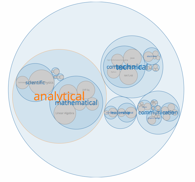
One thing that was lacking in the People-Projects-Skills graphic is any quantitative assessment of ability. A list of skills doesn't tell you how well you know them so I built this zoomable pack hierarchy to make it obvious how well I know something based on its size.

When I put down my list of "known languages," I'm not saying that I know how to do everything with an Arduino or python. In a linear text resume it's impossible to express how well you know a given skill. So most kid's today have technical skill lists that bloat with a thousand things they've tried once or just vaguely understand.
It's clear that if this sort of hierarchy of skills were formalized better it would become a heck of a lot more useful. Also publicly accessible scores for various tangible skills would convert this from a subjective assessment into an objective one.
Adding Education
Modern degrees are increasingly becoming more and more flexible. We give students the opportunity to learn diverse things, but unfortunately, we don't try to accurately inform employers about what their employees were actually taught. That makes a 21st century degree meaningless in terms of subject matter.

I recently saw an article by Jeff Selingo (ironically the article was on LinkedIn) where he mentioned this idea of a "digital backpack," that follow you through life, documenting your accrual of skills. The main problem I see with that is the ability to parse who knows what and how they learned it in such a disordered system.
This interconnection between skills and education would be fun to work out in the future if I ever get a chance.
Interest graph
I'll admit that this one was mostly just for fun. I thought it would be nice to see the way all the things I like might be related.

D3's force plots are just a fun way to draw connection matrices. They tend to look OK as long as the connectivity of the graph isn't too high. Maybe that's a good way to judge whether you're interested in too many things!
Death to the Old-Fashioned CV
I did succumb to the peer pressure and include a link to my paper CV too at the end. Hopefully someday there will be a better way, but for now I think it's worthwhile to show off my not-too-shabby credentials in the classic style.


